It’s taken us four installments to set enough context around just some of the operational requirements when building out a business in emerging markets. To recap:
- Why Distributors Use Pay-As-You-Go framed the question — how does a Pay-As-You-Go solar distribution company actually operate?
- How Mobile Network Operators Utilize Prepaid Scratch Cards discussed the impedance mismatch between a high-tech product offering and a low-tech operating environment, and introduced the concept of keycodes.
- How Secure Pay-As-You-Go Keycode Systems Operate described the two major architectures of keycode systems: centralized vs distributed security.
- How Pay-As-You-Go Product Activation Works differentiated between hardware features of mobile phones versus pay-as-you-go solar systems, and laid out some requirements for a robust, secure, keycode system.
- The Design Approach for Developing Keycode Systems << You’re Here
We’re finally ready to start talking about the design process we went through for the Angaza keycode system.
From the user’s point of view, there are two main ways to interact with a keycode system on a pay-as-you-go solar device.
User Input
After making an installment payment, the user receives a keycode. Remember that this keycode:
- Must be specific to an individual device,
- May only be used a maximum of one time,
- May be entered in any order,
- May be worth a variable amount, proportional to the installment payment, and
- Should not be easily guessable.
A pathologically naive keycode system might look like this:
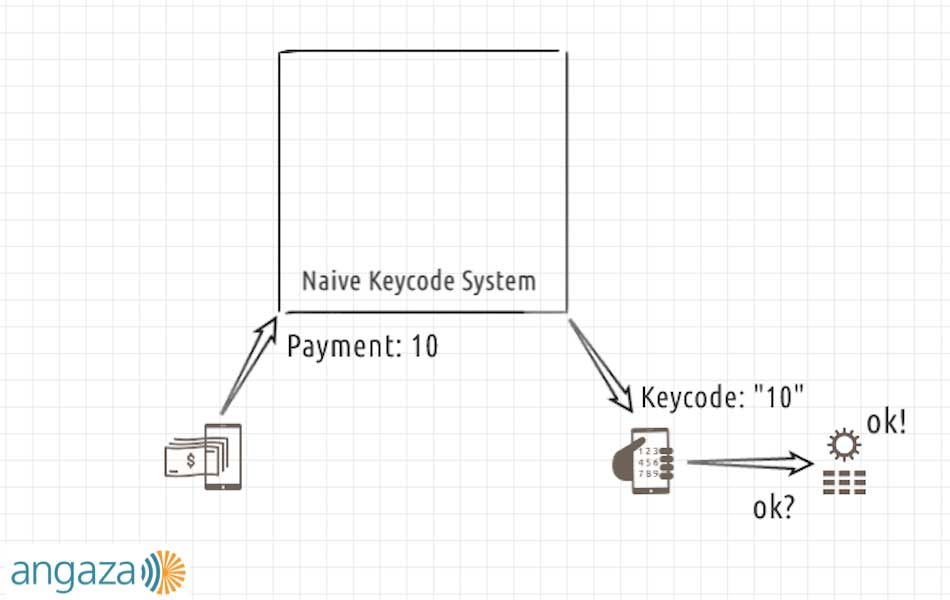
In this system:
- The user makes a payment of 31 currency units — payment for one month of energy,
- The backend generates a keycode that is literally just the string “31,” and
- The solar device accepts it and becomes enabled.
It won’t take very long for the user to figure out that the generated keycodes are whatever the payment amount was and that the device accepts it as valid. From that point on, the user no longer needs to actually make payments; they can just type “31” into the device over and over and it will always work.
This system isn’t very flexible either. The generated keycode directly echoes the number of days paid. What if the user can only pay for less than a full day? Or what if they pay for 28.5 days? It doesn’t seem possible to represent either type of payment with this system.
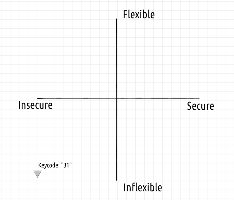
The naive keycode system is neither secure nor flexible.
We need something better.
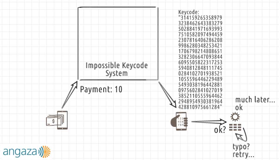
In this system:
- The user makes a payment of 31 currency units,
- The backend somehow generates a very long, harder-to-guess keycode, which contains the payment information of “31” in the beginning of the code, and a security check sequence starting with “4159…” appended to the end,
- The user makes a typo part way through and has to start from the beginning, and
- Many attempts later, the user is finally successful; the solar device accepts it and becomes enabled.
Certainly the keycodes generated by this second system are much harder to guess, which makes them slightly more secure. That security requires using more digits in the keycode. If we used even more digits, we also might be able to represent fractional payments, giving the overall keycode system some flexibility.
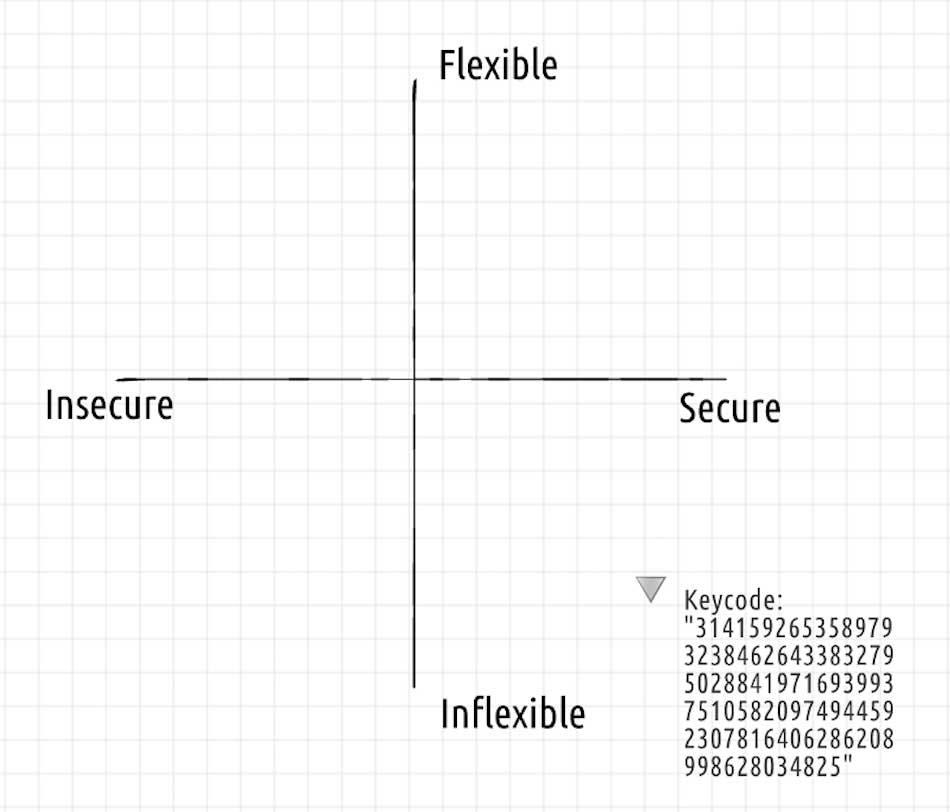
The impossible keycode system is more secure, but still not flexible.
But such a huge string of digits is very easy to mistype, and the solar device might not have any visual feedback about the numbers that have already been entered. Additionally, we need to consider that the actual SMS might be too long to display on a low-resolution feature phone.
Usability prevents us from making the keycode arbitrarily long. We therefore have two goals — flexibility and security — competing for the same scarce resource: keycode digits.
These two examples were contrived to demonstrate the extremes between usability and security. The user-focused keycode system designer must make careful choices to strike a happy balance between the two, based on the specific usability constraints they identify.
Unfortunately, as is apparent from the examples, the only real degree of design freedom is the length of the keycode. And even then, the keycode can still be influenced by the physical hardware design.
For example, consider the following keycode and product combinations.
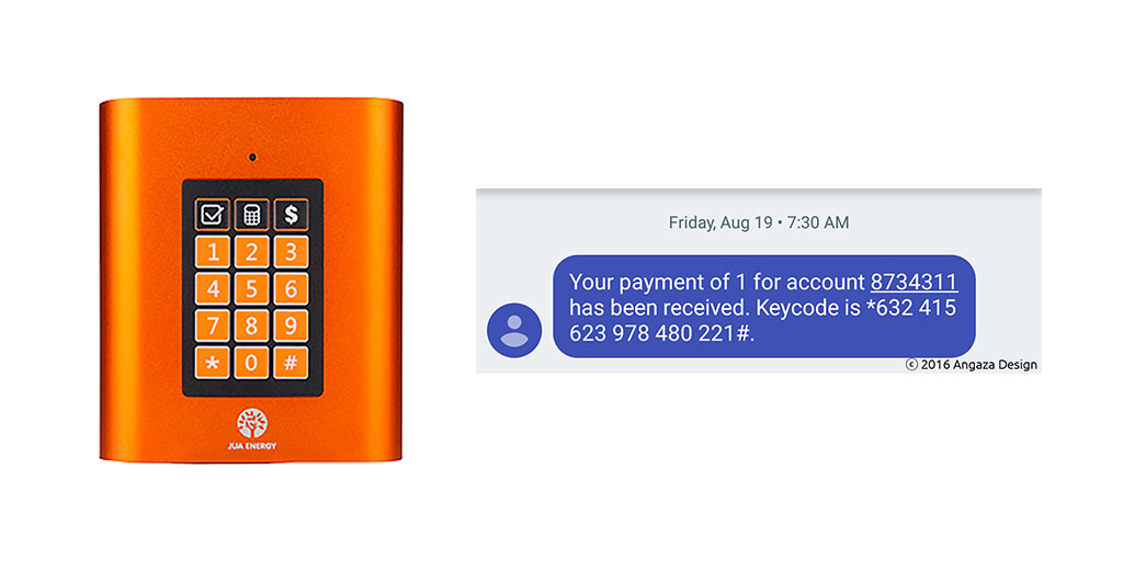 The Jua H1G and corresponding keycode
The Jua H1G has a 4×3 matrix keypad with numerals 0–9 and additional * and # symbols.
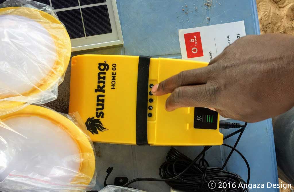
In contrast, the Sun King Home 60 has a much smaller keypad, containing only the numerals 1–5. If you tried to enter the keycode from the Jua, you would get stuck immediately, wondering how to enter the “*” key, let alone the “632” triplet.
A keycode more appropriate for the Sun King Home 60
As you can see from our real world examples, we’ve settled on keycodes that are between 15 and 18 digits in length, depending on the product type.
We were initially concerned that 18 digits would have caused too many user input errors, but after a number of rounds of testing, as well as continuously collecting field data, this length seems to fall within the acceptable range of usability. Our testing matched the other piece of prior art very common in our markets — users were already accustomed to entering long USSD codes into their phones to access mobile money features, such as M-PESA¹.
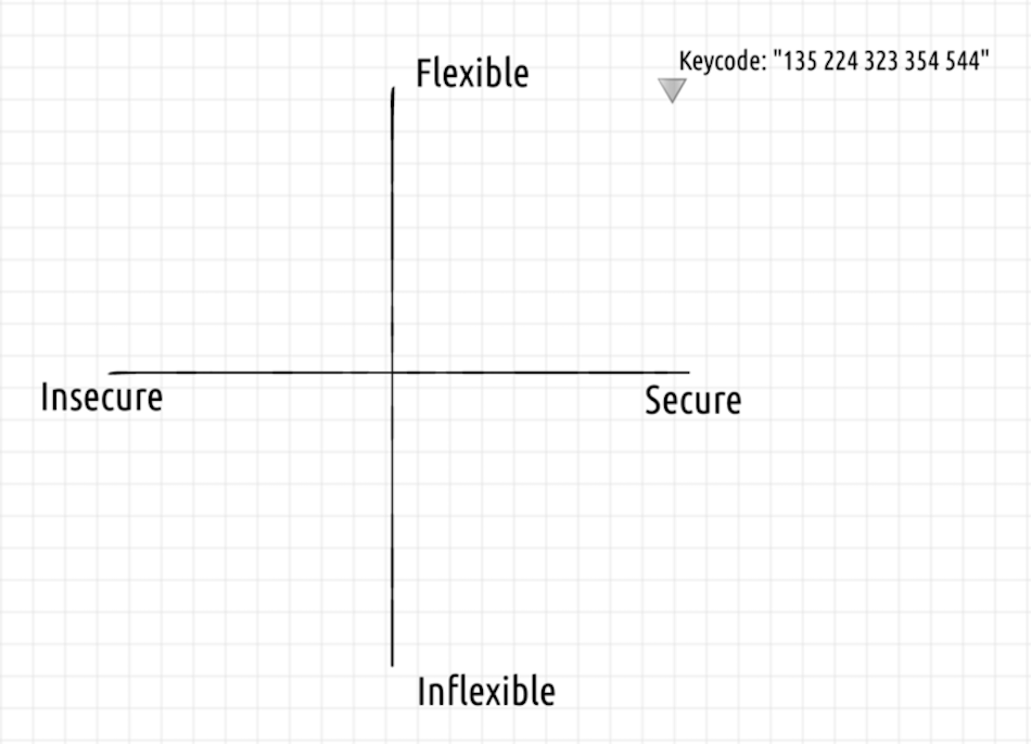
Angaza keycodes are up and to the right
Behind the scenes, our keycodes have checksums to help ensure fidelity, and we also attempt to reduce the number of repeated keys in a row, which can also help with user entry.
And of course, they satisfy the other system requirements. Each keycode is keyed to a specific hardware unit, it can be used only once per unit, and they support variable payment amounts, so that clients can pay more or less, as they have more or less money on hand.
Based on these properties, we believe that the Angaza keycode protocols² are secure, flexible, and usable.
User Feedback
This series has spent a long time talking about keycode input. The other way that a user interacts with the system is the feedback that it provides.
Fancy displays are more expensive, but they also require more CPU power to drive, and consume more energy to operate. All of these constraints are magnified when designing products for this particular consumer space. In the Angaza hardware team, we talk about “1-bit UX” quite often. We ask ourselves what information can be transmitted to users with a huge variance of technological sophistication, when you only have a single blinky LED for feedback. Like any good product development, finding out the answers to those questions is a process. Hypotheses are formed, tests are performed, results are analyzed, and the next iteration occurs.
Take one hypothesis: that feedback to the user about an incorrectly entered keycode should be provided quickly — immediately after a mistake is made, if possible —rather than requiring the user to enter an entire keycode before receiving an accept or reject response. This idea sounded good in theory. We wanted to mitigate user friction associated with entering long digit sequences. Enabling the user to catch errors faster and start over sooner seemed like a great way to do that. One obstacle with this approach is that implementing fast failure feedback often requires lengthening the keycode itself³. That fact meant we would potentially be using a longer keycode, making mistakes more likely, purely to report those exact mistakes faster. Not a fun tradeoff. Another obstacle became clear in user testing: fast failure feedback simply didn’t make for a better user experience. In many cases, complex feedback provided during code entry made the product’s behavior feel unpredictable⁴.
The inclusion of hands-on prototyping during the protocol design process enabled this type of valuable iterative development. Bouncing back and forth between answering questions in protocol design (“how could we provide fast failure feedback?”) and answering questions in user experience (“how important is providing fast failure feedback?”) let us avoid sinking cost into design dead ends. That efficiency resulted in better design decisions.
In software development, you often shoot for putting solutions in front of users over multiple stages, so that lessons learned from earlier stages can guide later development. In hardware product development, releasing incremental polished product versions is rarely feasible because atoms are not nearly as malleable as bits, so hands-on prototyping is a proxy for that process. After some experimentation, we’ve learned that some of our favorite hardware prototyping tools include materials as humble as cardboard and the venerable Arduino. Cardboard and sticky notes allow us to provide some vague semblance of the actual product, which provides a useful anchor point to physical reality. This can help quickly gauge if there are any glaring issues with the paper specifications.
One of the things we were testing was sourcing a remote control. In our expected use case, we imagined a user holding a phone in one hand showing the keycode, while typing the code in with the other hand. It may be obvious, but imagine if we selected a remote control that requires two hands to operate. That would have been a usability disaster.
The other key aspect of using cardboard and paper mockups is that they are deliberately low fidelity, and there is no way that a tester will ever confuse these mockups for the final product. During a rapid test iteration phase, we want to focus on the fundamental user interactions without getting distracted by unimportant details.
Imagine if we’d gone through the trouble of producing an actual plastic part for the base of the mocked up solar device. Testers may have gotten distracted by its color, shape, size, etc. They may have complained that the buttons felt mushy or that the unit itself felt flimsy. By using a low-fidelity cardboard mockup, we’ve clearly signaled that although this is kind of what the product will look like, we’re not focused on that in this test phase.
At the same time, it’s important that your mockup is functional enough so you can actually collect meaningful data.
As we were developing the firmware that processes keycodes, we wanted to test our ability to provide user feedback under multiple scenarios. This testing was especially important since many of our products have only a single LED that we can use to provide feedback.
 Image source: snazzyguy
In fact, we wanted to check whether a single LED was actually sufficient to provide meaningful feedback or not. Perhaps we would need different colors, or maybe we would need multiple LEDs after all?
And presuming you end up with a single LED design, the most important question we wanted to answer was: what kind of semantics can be provided with only a single bit of information: an LED that can either be on or off?
Humans are pretty good at recognizing patterns, so it quickly became obvious to us that by modifying the duration of how long the LED was on or off, we could create visually distinct groups of blinking. Once we recognized what was possible, the task quickly shifted to defining the actual patterns themselves, in order to create a design language, which we hadn’t thought was possible for a single LED.
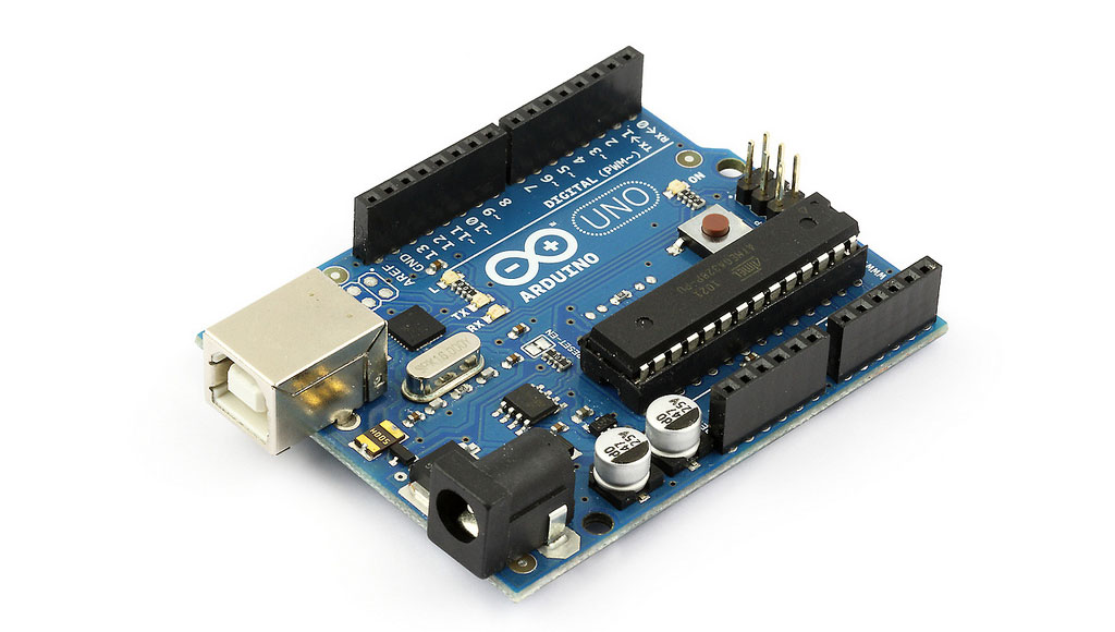 Image source: Snootlab
During this period, testing with the Arduino was key, because the development environment was low friction, and the platform is perfectly designed for functions like making LEDs blink for various amounts of time. This approach saved us tons of time compared to setting up a full firmware development environment and having to hook up a JTAG cable to an expensive developer board.
Even better, is that our designer, Krispin, was literally sitting next to the tester, selecting from the various blinking subroutines in the Arduino IDE, in response to the tester’s input. This technique dramatically increased the amount of pure user testing we could accomplish, because the tester could run through the keycode sequence multiple times, and Krispin would simply select the next subroutine blinking pattern, without forcing the tester to wait for the Arduino to be reprogrammed. It also meant that Krispin could act as “human firmware,” using his understanding of the system to pick the next response. Putting a human in the loop let us try new ideas immediately without first implementing every idea completely in software.
One iteration of testing included what is meant to be a soothing success indicator that the keycode was successfully entered. We ran through multiple iterations of the slow pulsating pattern, looking for emotional reactions in our test group, trying to figure out minute details such as the optimum number of blinks and speed of pulsing that would most clearly indicate success.
By this point in our testing, we had learned that grouping the digits into triplets, and separating each triplet with a space was important to help users master a long series of digits. We considered — and tested — using a different separator, such as a “-” character, but we learned that clients would ask “How do I enter the ‘-‘ character? I don’t see it on this keypad…” and decided to remove it.
In the next iteration, we tested our failure indicator, which attempts to convey to the user that the keycode wasn’t accepted for some reason or another. We started calling this pattern the “angry rejection blinks,” and indeed, compared to the gentle pulsing of the success pattern, this set of numerous and rapid blinks feels more agitated and urgent.
In our actual firmware implementation itself, a keycode may be rejected for a number of reasons. Perhaps the user made a typo. Or perhaps the user is attempting to reuse a keycode that has already been used previously (recall that we must not allow the second scenario, in order to prevent what are called “replay attacks”).
As much as engineers love being precise and desiring to communicate why a specific keycode entry failed, we quickly learned that with a single LED, there was no way that any normal human being could possibly discern a rejection pattern of say, 5 blinks for a typo vs 7 blinks for a reuse error. Testing helped us come to the conclusion that in certain cases, we could provide more clarity by intentionally conflating internal error conditions.
Wrapping Up
And so there you have it. You’ve now gotten a fractal glimpse of what the engineering and design process are like at Angaza.
- We start with a broad understanding of the existing operational contexts — what sorts of geographic, infrastructure, and cultural challenges exist for the particular problem we’re trying to solve in the off-grid energy market?
- We look for prior art, and try to really understand those solutions, especially their strengths and weaknesses. We owe a big debt to the telecom industry for all of their existing infrastructure investments.
- We think through and build our own solution, usually from first principles, taking into account our more restrictive design constraints, and then sanity check against the existing prior art.
- We relentlessly test and iterate, not only internally, but with a special focus on field testing, where we can gut check our assumptions. There is a surprising amount of overlap between standard “silicon valley” sensibilities and consumer behavior in emerging markets, but of course there are quite a number of differences as well.
The last bit is what keeps our work at Angaza varied and engaging. What may be a standard problem with a cookie cutter solution in a world with reliable and speedy internet connections turns out to require a completely different approach in areas with spotty 2G service.
—
¹ We deliberately designed our longer-format keycodes to mimic M-PESA USSD codes. As an example, in Kenya, Safaricom users are already used to typing *144# to check airtime balance, and even longer codes to top-up with newly purchased airtime.
² We have several keycode protocol variants, depending on product requirements.
³ Depending on the structure of your protocol, you may need additional digits dedicated to catching errors.
⁴ Noticing and acting upon that feedback required the user to pay close attention to the product during code entry and for them to have a good understanding of the product’s internal rules governing behavior. The feature would most likely end up benefiting only the savviest users who needed it least. Also, one of the most common entry errors was inadvertent symbol omission, i.e., thinking that a key was pressed when in fact it was not. In those cases, even with perfect immediate failure feedback, we would end up reporting failure on the following key — a key that was, from the user’s perspective, completely correct.